Vive Video
Rethinking media consumption in spatial environments
OVERVIEW
As VR adoption grew, video quickly became one of its most common use cases.
Vive Video was designed as an immersive media player for standard, 3D, 180°, and 360° content. But while the medium was new, the experience was not.
The interface relied heavily on 2D paradigms. Grid-based carousels and floating windows were simply placed into 3D space, resulting in something that felt less like immersion and more like a larger screen hovering in front of you.
The opportunity was to rethink how media browsing and interaction should work in a spatial context, without losing the familiarity users relied on.
THE PROBLEM
The experience broke down in two key ways.
Browsing and viewing were disconnected. Users had to exit immersive content to find something else to watch, interrupting the experience entirely. If the next video didn’t resonate, many simply left the app.
At the same time, the interface itself felt unnatural. Walls of tiles and flat UI surfaces wrapped around the user, creating discomfort and breaking presence.
These patterns worked in 2D. In VR, they didn’t.
DESIGN DECISIONS
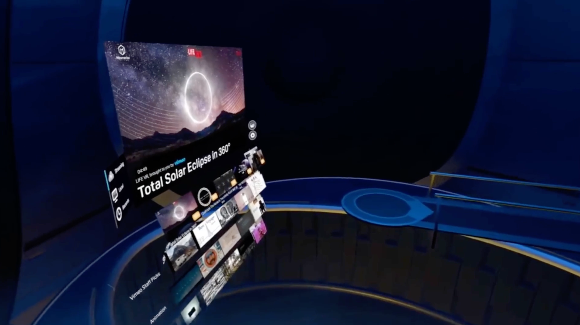
CONTINUOUS, IN-EXPERIENCE BROWSING
We introduced an in-experience browsing system that allowed users to move between videos without exiting playback. This “micro-controller” enabled continuous discovery, especially important for short-form and 360° content.
Below: Early interaction prototype for a self-contained transport controller.
Below: Early visual interaction mockups for a self-contained browse widget, providing previews and ability to navigate from within an immersive video experience.
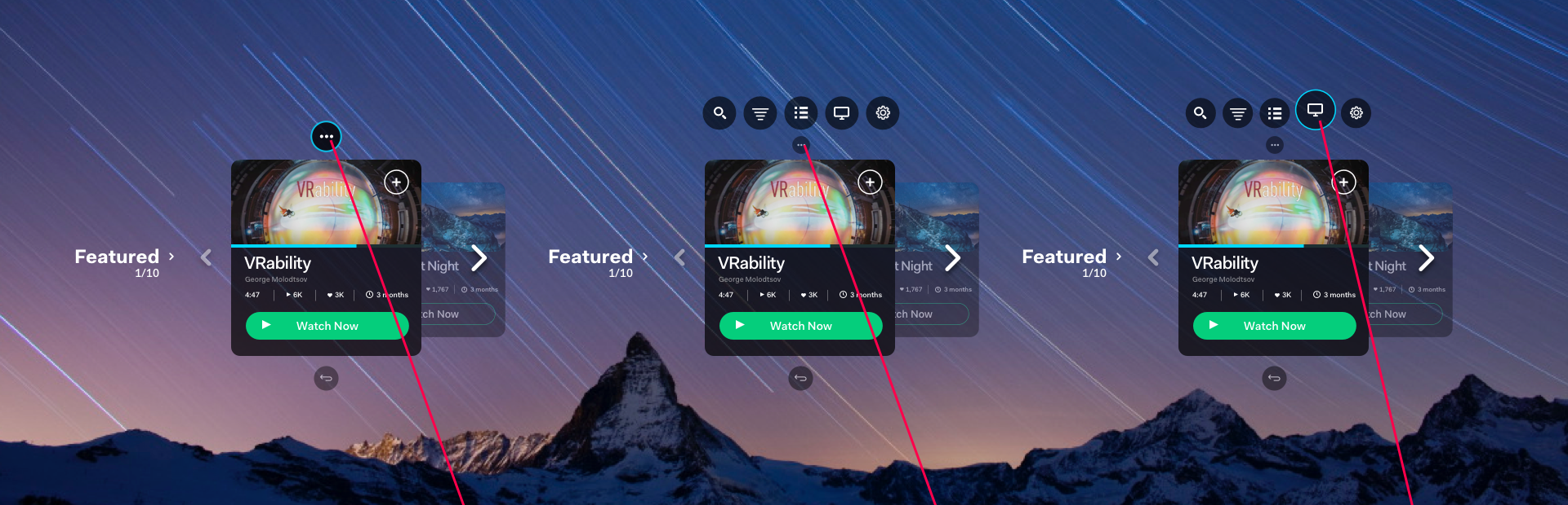
REIMAGINING THE CAROUSEL FOR 3D
Rather than removing familiar patterns, we evolved them.
Tiles were tilted for readability, layered for depth, and given spatial behavior. Instead of disappearing, they shrank and stacked out of view, maintaining orientation and continuity.
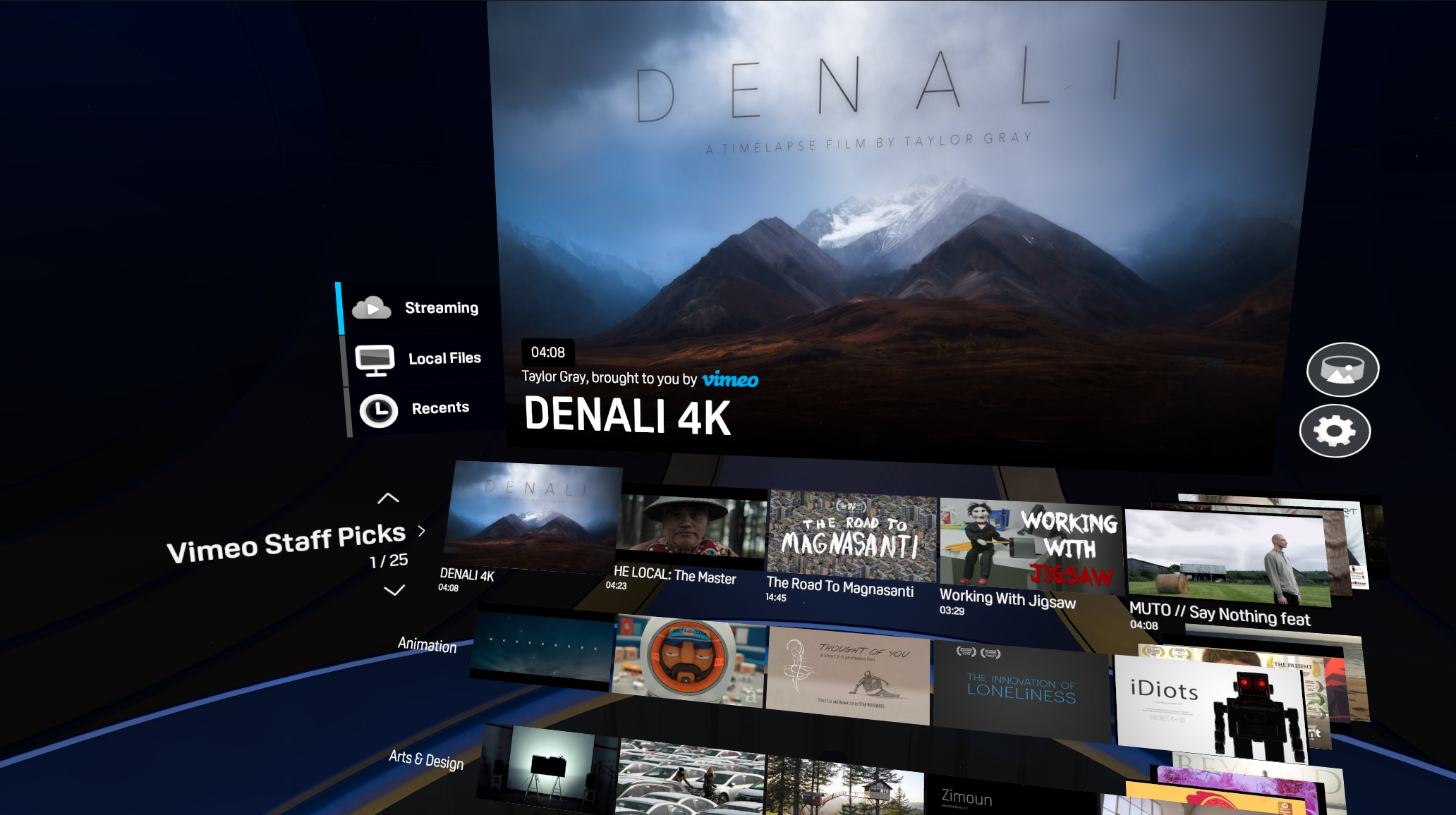
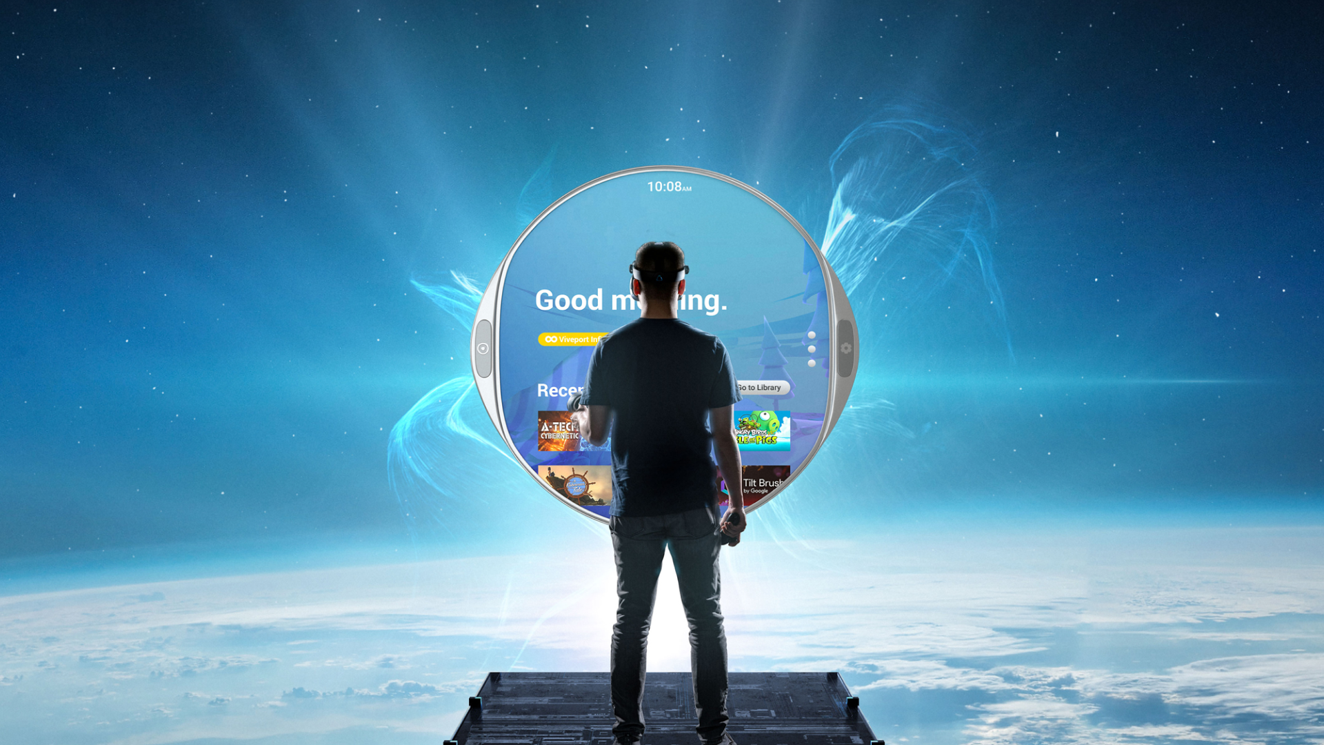
DESIGNING FOR PRESENCE AND COMFORT
We redesigned the viewing environment to feel more intimate and grounded.
The original theater-like space felt empty, boxy and disorienting. The updated environment emphasized comfort, intimacy, and flexibility, including a spherical design that supported repositioned viewing and relaxed postures.
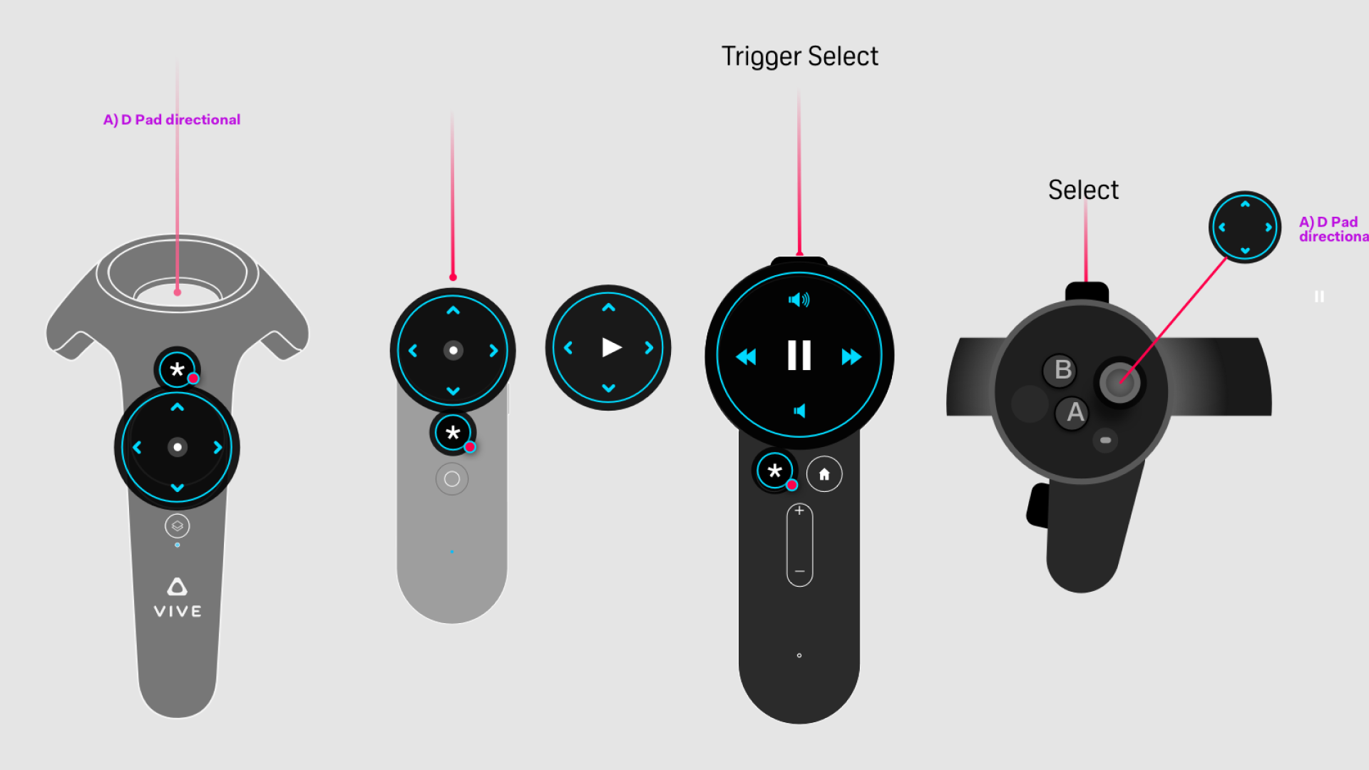
ACCESSIBILITY & INPUT-AWARE INTERACTION
Early VR introduced a mix of 3DoF and 6DoF inputs, each with different capabilities and limitations.
Pointing at small UI targets or holding arms up for extended periods created friction and fatigue. At the same time, users often lacked clarity around available controls.
To address this, I designed contextual, hovering controls anchored to the controller. These surfaced available actions based on context, allowing users to glance down and understand how to interact.
This reduced reliance on precise pointing, improved accessibility, and made interaction feel intuitive without requiring users to learn new systems through trial and error.
EXPANDING CONTENT THROUGH PARTNERSHIP
We established a key partnership with Vimeo to provide high-quality streaming content, while maintaining support for personal media libraries.
This balanced curated discovery with user control, reinforcing the platform as both a content hub and personal player.
OUTCOME
Vive Video became one of the most widely used applications in the early VR ecosystem, and a top-rated media app on SteamVR.
More importantly, it helped establish a new way of thinking about interaction in spatial environments.
The shift from separate modes to continuous experience, from flat UI to spatial behavior, and from passive viewing to active exploration directly informed later work on the Vive Reality System.
What began as a media player became an early proving ground for how immersive systems should feel.
Selected Works
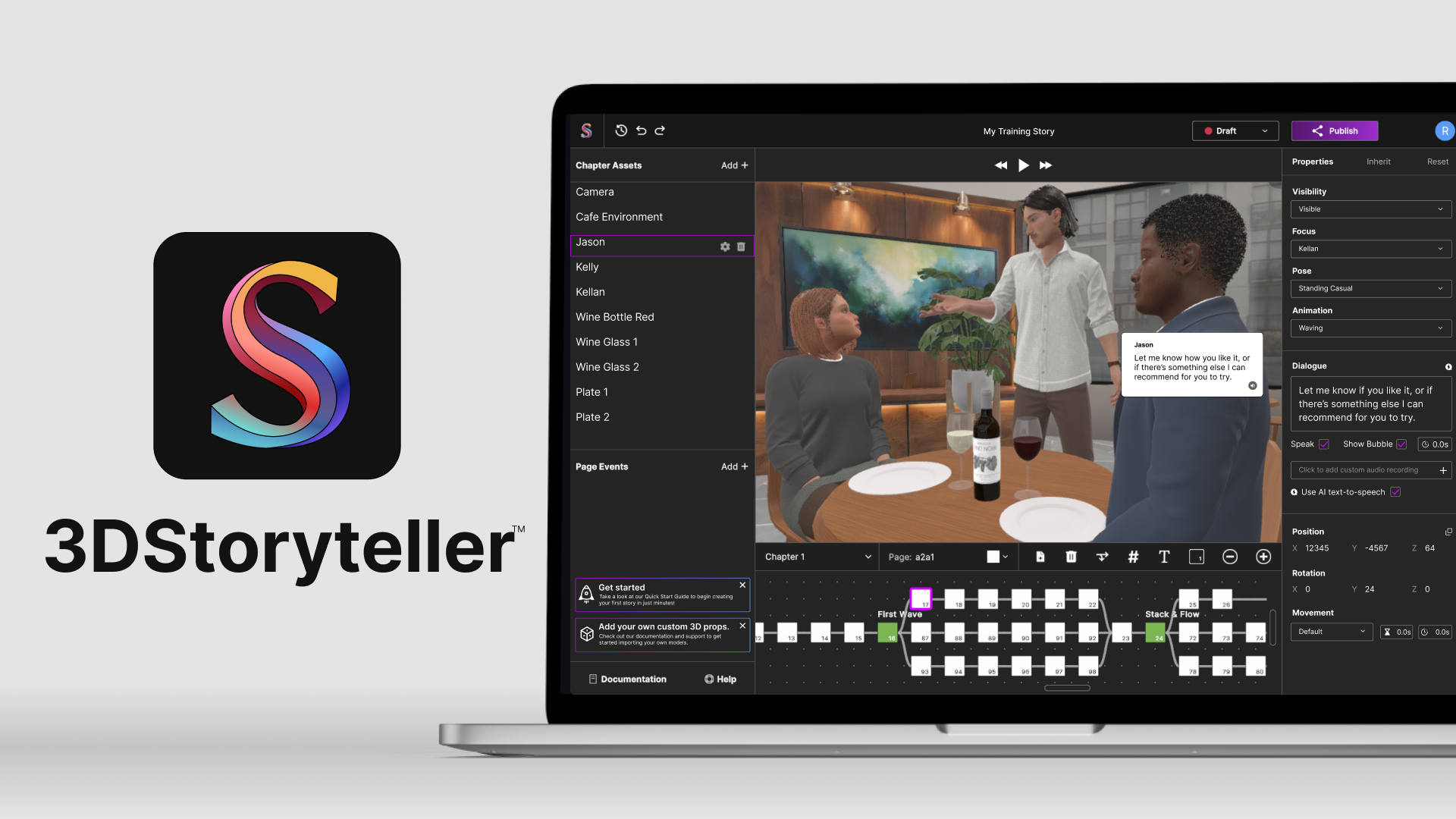
3DStorytellerExperiential Storytelling Platform
Vive Reality System (HTC Vive)Spatial Interaction System
Vive Video (HTC Vive)Immersive Media Player
PLAYON.tvStreaming Media Aggregator
SkryMinimal Wayfinding for Riders