Vive Reality System (VRS)
Designing a spatial operating system for a new medium
EXECUTIVE SUMMARY
As virtual reality evolved from experimental hardware into a consumer platform, a new challenge emerged.
The technology had advanced, but the experience had not.
Most VR interfaces borrowed directly from 2D design paradigms. Floating panels, grids of tiles, and windowed menus were transplanted into 3D space, creating experiences that felt unfamiliar, unintuitive, and often disorienting.
At the same time, early users had no shared expectations for how VR should work. There were no established patterns, no proven systems, and no clear definition of what a “native” spatial interface should feel like.
I led 0–1 concept development, product strategy, and global design for the Vive Reality System, defining a new interaction model for spatial computing that shipped with the Vive Cosmos platform and influenced HTC’s broader ecosystem across devices.
THE CHALLENGE
Designing for VR meant designing without a map.
Each new degree of freedom introduced by spatial hardware increased both the opportunity and the complexity of interaction. Traditional UI patterns broke down quickly. Flat panels felt disconnected from the world around them. Menus that worked on a screen became awkward or even frustrating in space.
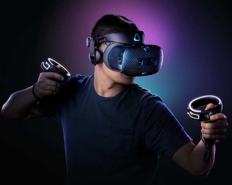
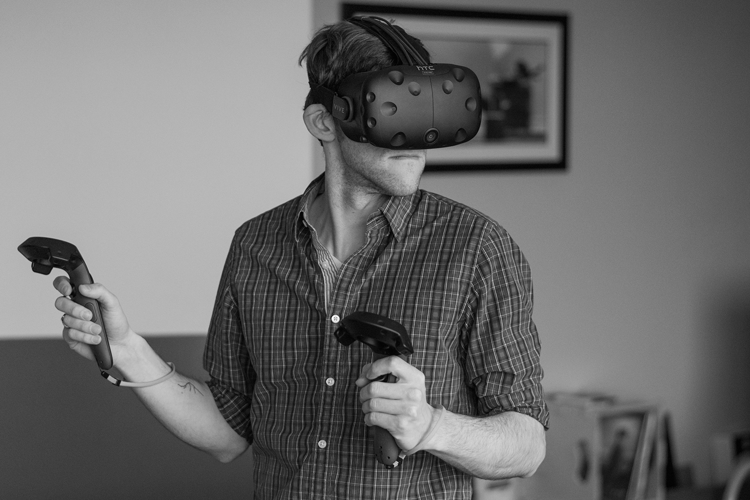
Even simple actions became problematic. Reaching for a button could result in users hitting real-world walls or furniture. Controller inputs were unfamiliar, and accidental interactions were common. The system needed to feel intuitive, but nothing about the medium was familiar.
At the same time, Vive was strategically shifting its focus. Early VR products had catered to expert users and gamers, but the goal now was to reach a broader, more casual audience. These users had lower tolerance for friction and little patience for learning complex systems.
There was also a broader ecosystem challenge. VR experiences were fragmented. Users would enter a single app or game, spend a short amount of time there, and then leave. There was little reason to stay within the system itself. No persistent identity, no sense of continuity, and no meaningful connection between experiences.
We were not just designing an interface. We were defining the foundation of a spatial ecosystem.
MY ROLE
I led the product from early concept through global launch as part of the Vive Cosmos release.
This included concept exploration, interaction design, experience architecture, and product strategy, as well as leading a global design team across regions and disciplines.
My work spanned early user research, prototyping, system definition, and cross-functional alignment, helping translate an ambiguous and rapidly evolving space into a cohesive product direction.
KEY INSIGHTS & DESIGN DECISIONS
LEARNING FROM USERS BEFORE DEFINING THE SYSTEM
Working with our user research team, we brought users into the process early. At that stage, any decision would have been a blind step, so we focused on understanding expectations rather than validating solutions. Rather than leading with assumptions, we wanted to tap into their imagination for what was possible.
In early sessions, we would hand users a controller and ask them to act out what they thought interacting in VR should feel like. These conversations often drifted into unexpected territory, but they revealed something important.
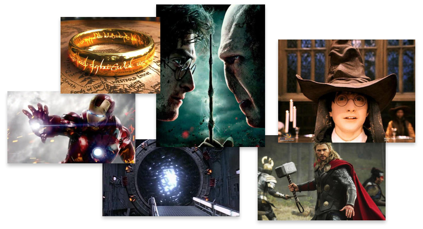
People did not describe interfaces in terms of tools or windows. They described them in terms of artifacts and companions. References came from stories rather than software. Iron Man’s JARVIS, a wand from Harry Potter, a ring from Lord of the Rings. They imagined themselves not as users, but as protagonists moving through a world.
When we compared that to what we were building, rows of floating tiles and panels, the gap was obvious.
DESIGNING FOR A HERO ON A JOURNEY
This insight became the foundation for what would later evolve into the HERO framework.
Rather than thinking about interfaces as static systems of windows and menus, we began to think about them as part of a continuous experience that moves with the user.
This reframing addressed several core issues. Flat interfaces did not feel human. Marketplace-driven systems did not leave space for identity or growth. Isolated experiences cut users off from relationships. And constantly pulling users in and out of contexts created a sense of disorientation.
The goal became designing something that felt cohesive, persistent, and aligned with the user’s sense of presence.

FROM UNCERTAINTY TO SHARED DIRECTION
The early phase of the project was defined by ambiguity. There was no clear right answer, and no established standard to follow. It often felt like navigating the open ocean without a compass.
From speaking with early participants I began to anchor to the idea of the user being a hero—and a system that did not simply reproduce flat screen in 3D space but captured the magic of the very stories they sought to embody.
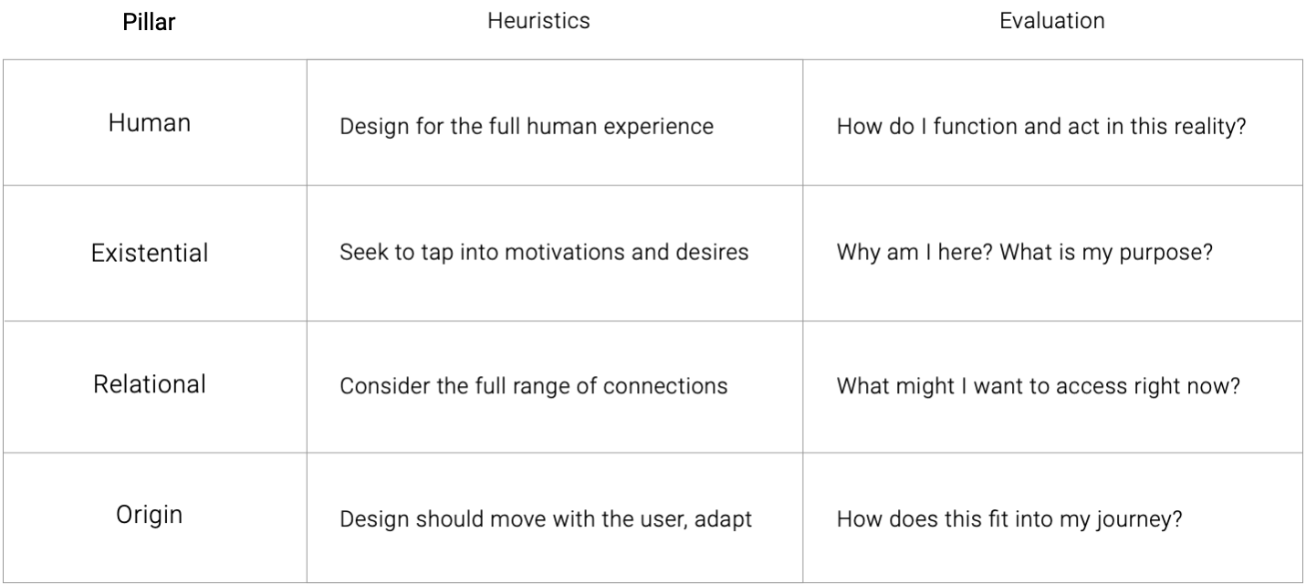
The HERO framework did not appear fully formed. It emerged gradually through iteration, research, and internal exploration. The idea of the “hero” came first, followed by the structure that helped articulate it, gradually growing into core pillars of:
- Human
- Existential
- Relationship
- Origin (later orientation)
Over time, as the framework was applied in critiques and design reviews, it began to provide a shared language for decision-making and a way to navigate an otherwise overwhelming design space.
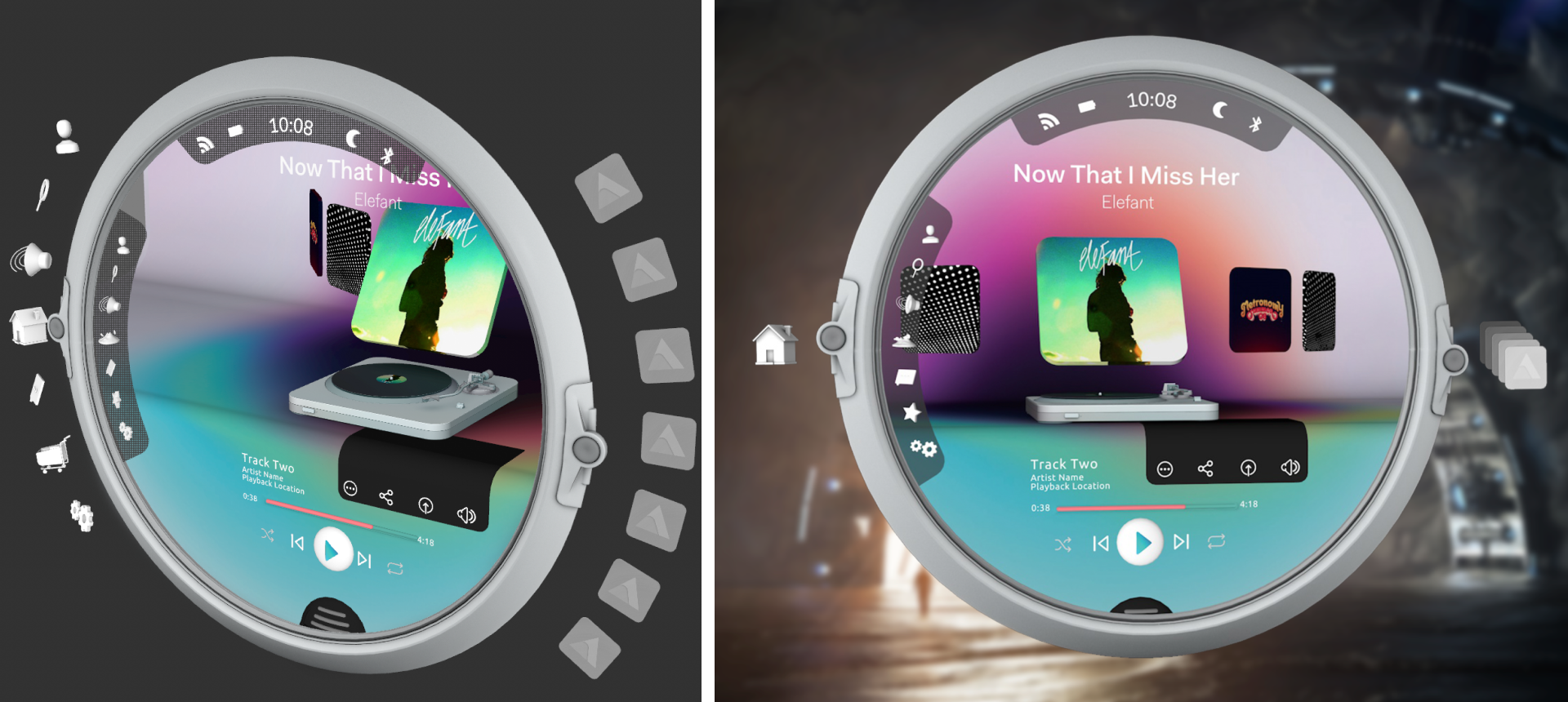
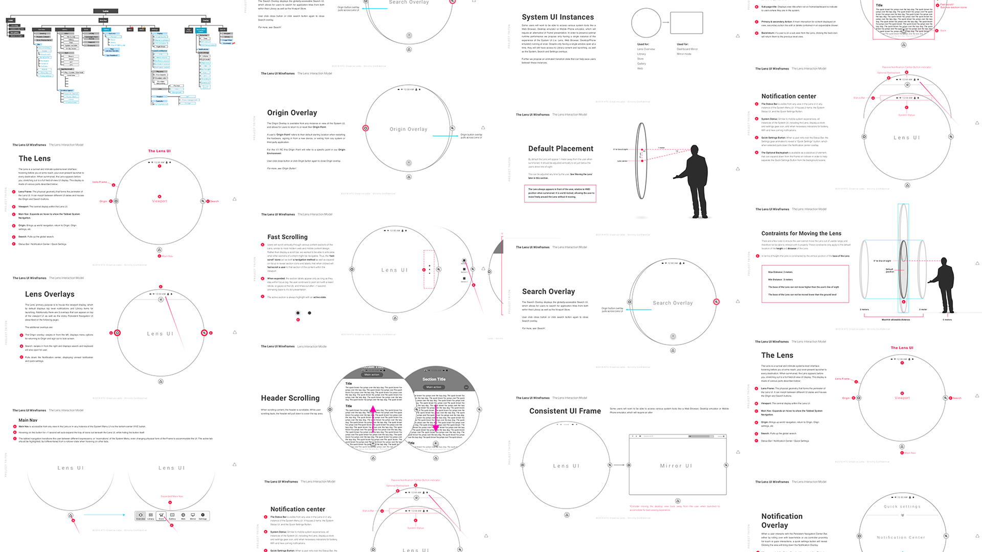
THE LENS: BALANCING FAMILIARITY AND POSSIBILITY
One of the most critical design challenges was defining how users would access and navigate content.
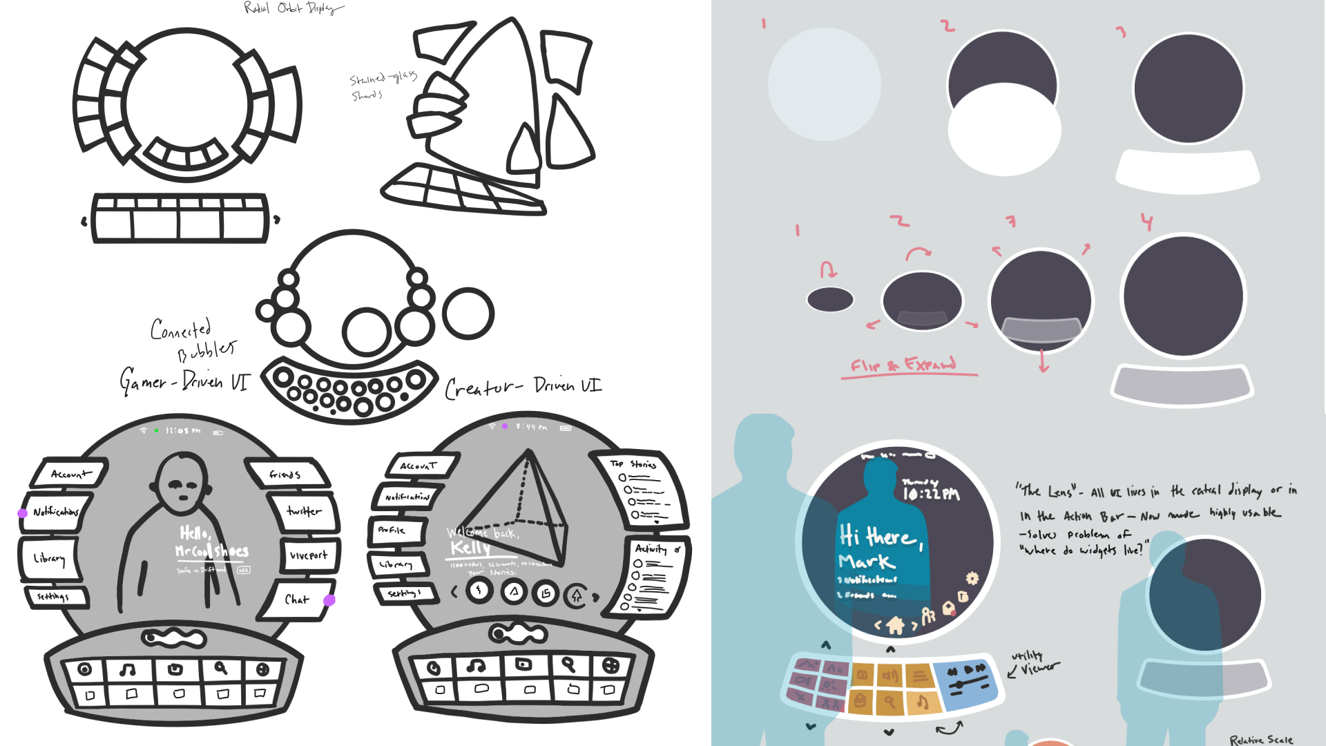
We explored a wide range of concepts. Some leaned heavily into spatial interaction, such as tables or belts that users could reach into and manipulate. While these ideas were compelling, they introduced friction. They required learning new behaviors, increased the likelihood of accidental input, and often clashed with real-world physical constraints.
Other directions relied on more familiar patterns, such as floating panels and carousels, but these felt flat and disconnected from the spatial nature of the medium.
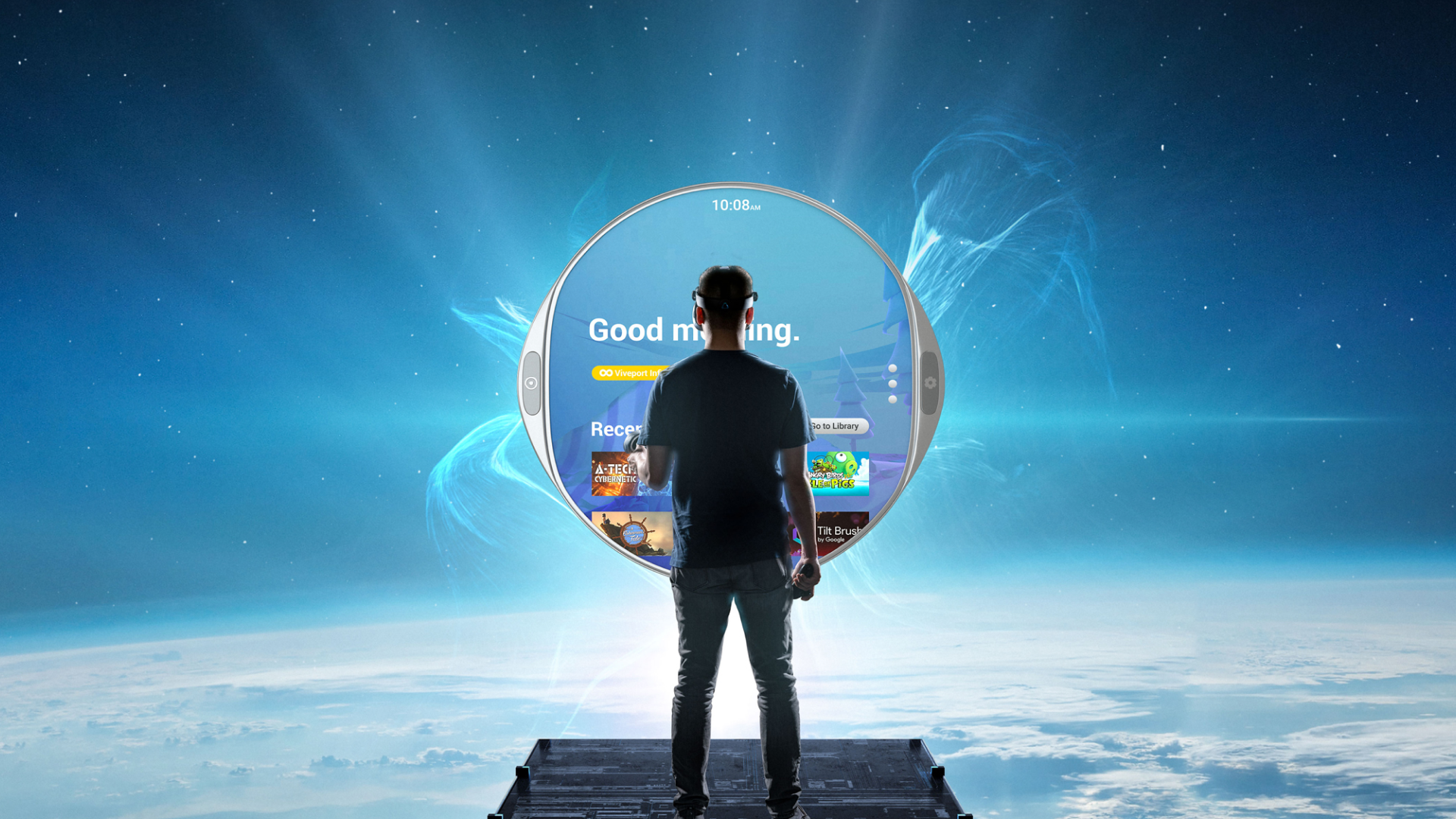
Below: Working with our team of technical artists and interaction designers we developed multiple concepts for how a novel 'companion' interface might look and feel, including tables a user could reach out and rotate, bubble-like menus that could appear anywhere, and a portal like 'lens' with a deep paralax effect.
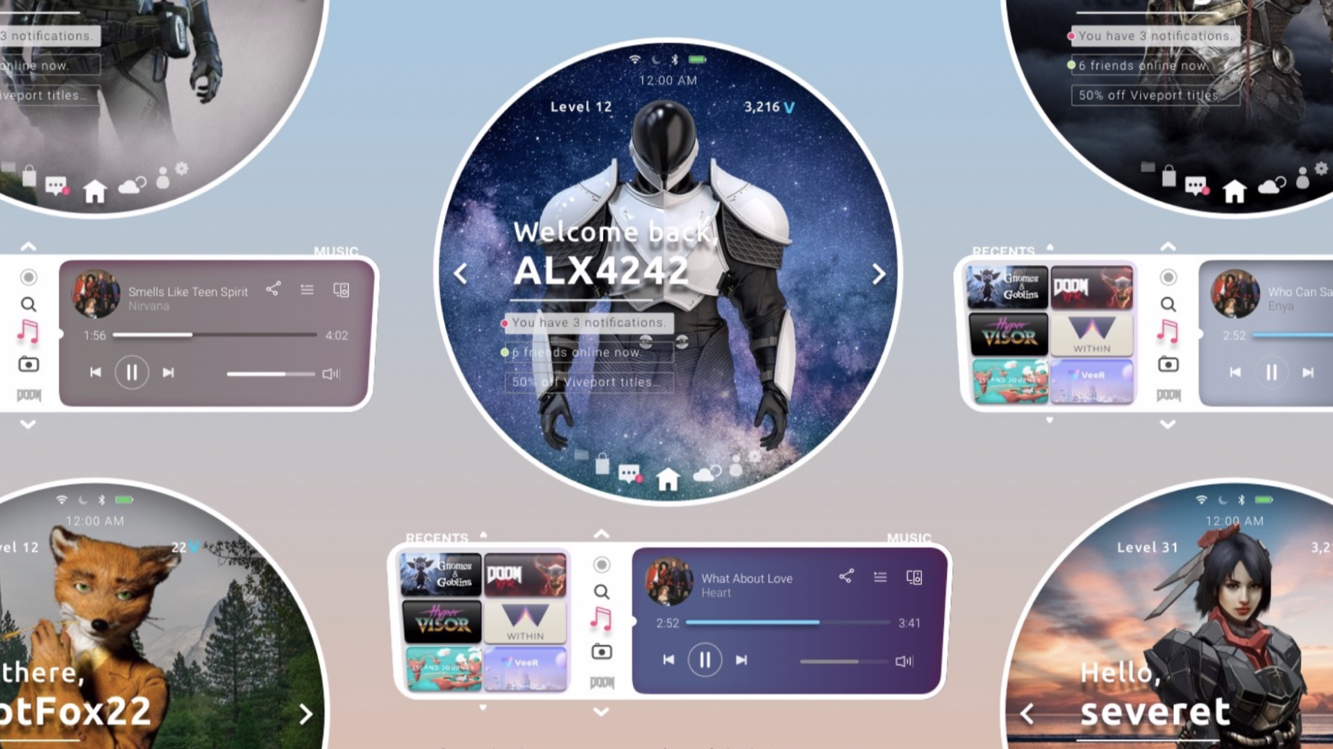
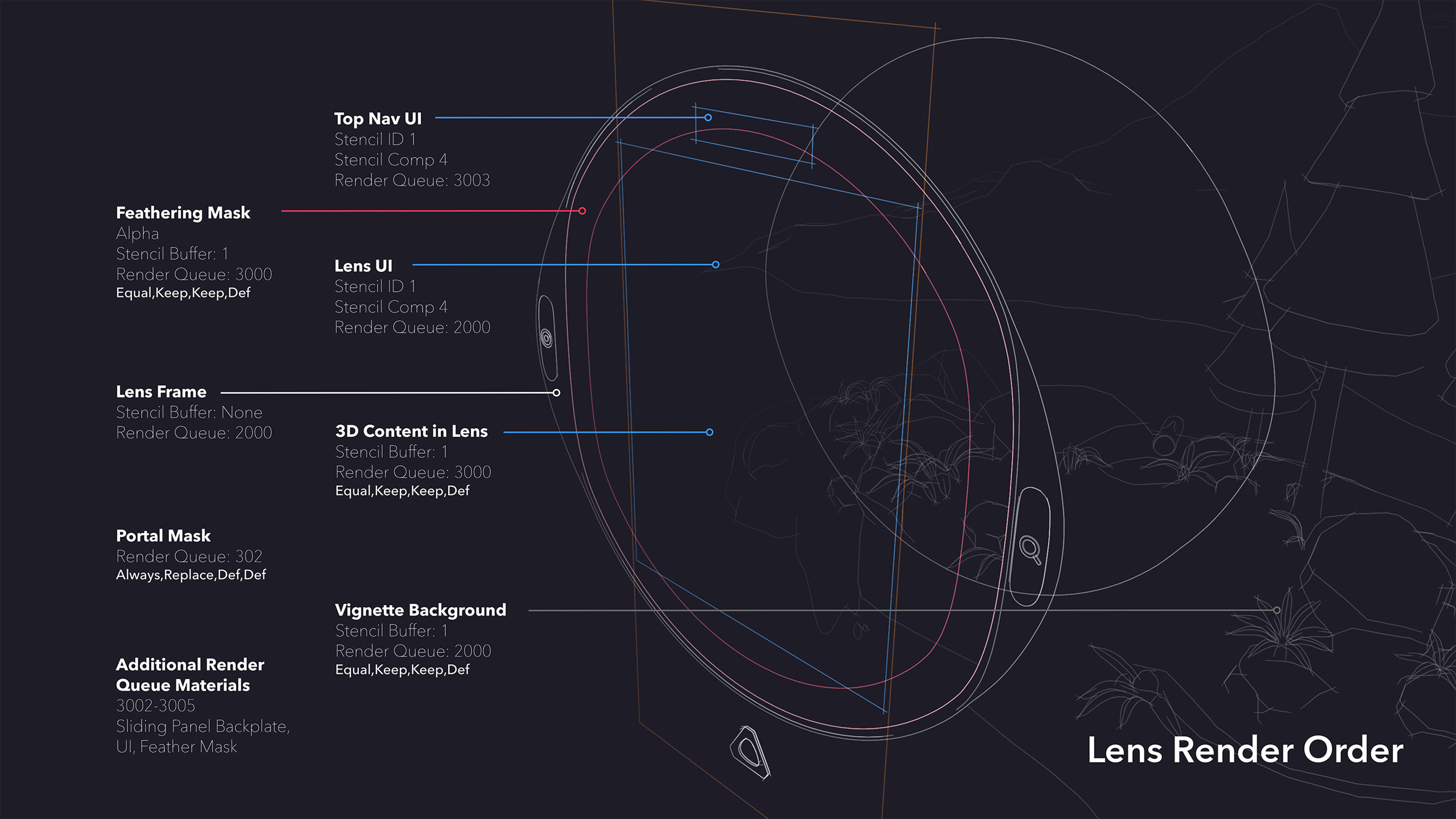
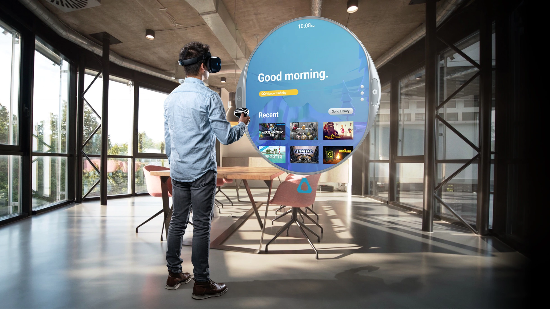
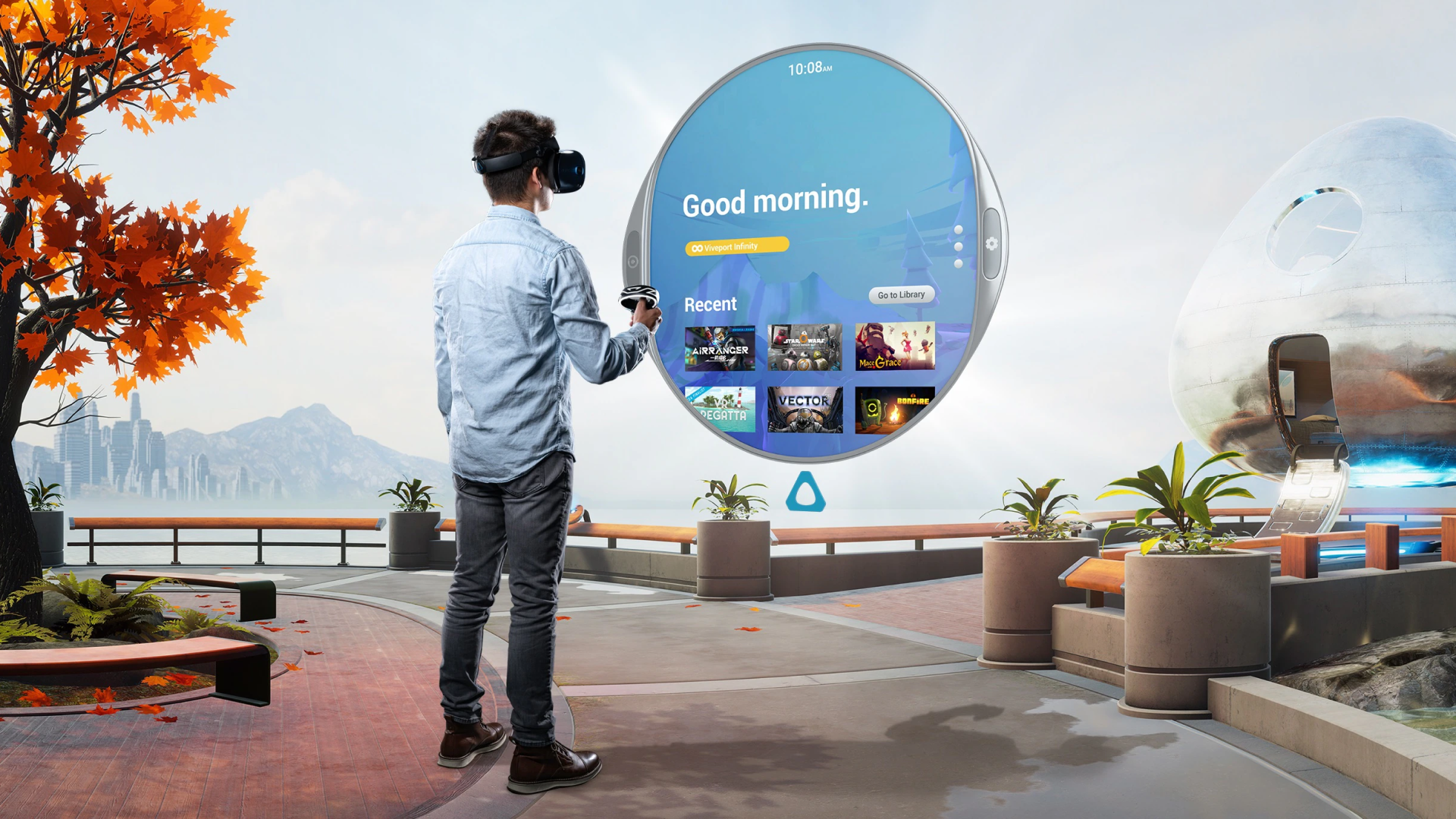
The Lens concept emerged as a balance between these extremes.
It functioned as both an interface and a portal. It retained familiar elements like content thumbnails and horizontal navigation, while presenting them within a spatial frame that felt integrated with the environment. Users did not feel like they were opening a menu so much as looking into another space.
This approach allowed us to introduce new spatial concepts without overwhelming users, and it adapted well across devices with different input capabilities, including lower-fidelity systems.
Below: My early iterations of the Lens design, from sketches to visual, onto interactive prototypes alongside tech artists.
DESIGNING FOR INTENT, NOT JUST INPUT
Another major challenge was interaction reliability.
Controller-based input introduced a range of issues. Users struggled to remember controls, accidental inputs were common, and the system often misinterpreted intent. For example, simply lowering a controller could trigger unintended interactions if the pointer remained active.
To address this, we designed layered interaction models that combined multiple signals, including gaze, proximity, and controller input, to better infer user intent. We also introduced rules to distinguish between active and inactive states, reducing unintended behavior.
We extended this thinking to the controllers themselves. By creating dynamic, context-aware overlays tied to the digital representation of the controller, users could glance down and understand available actions in real time. Controls adapted based on context, shifting between navigation, selection, and media interactions as needed.
RETHINKING HOME, MOVING TOWARDS ORIGIN
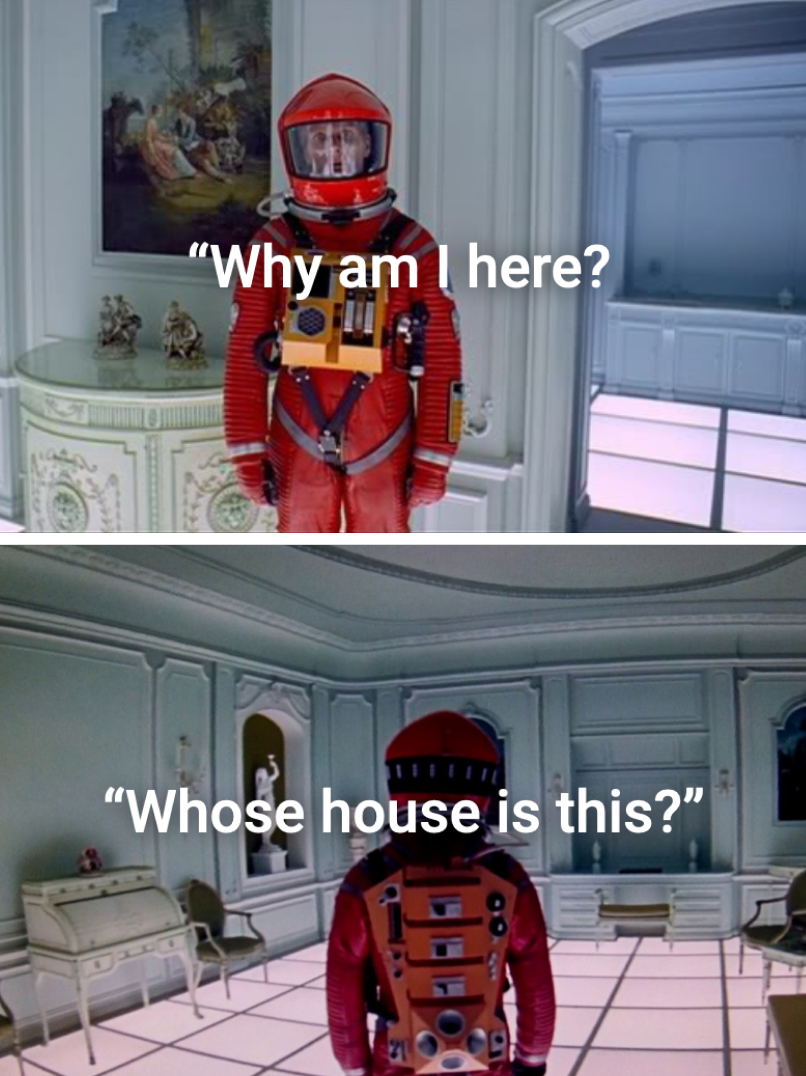
In addition to needing new interaction paradigms, we found that traditional concepts like “home” did not translate well to VR, something many early XR platforms and apps defaulted to as a familiar construct.
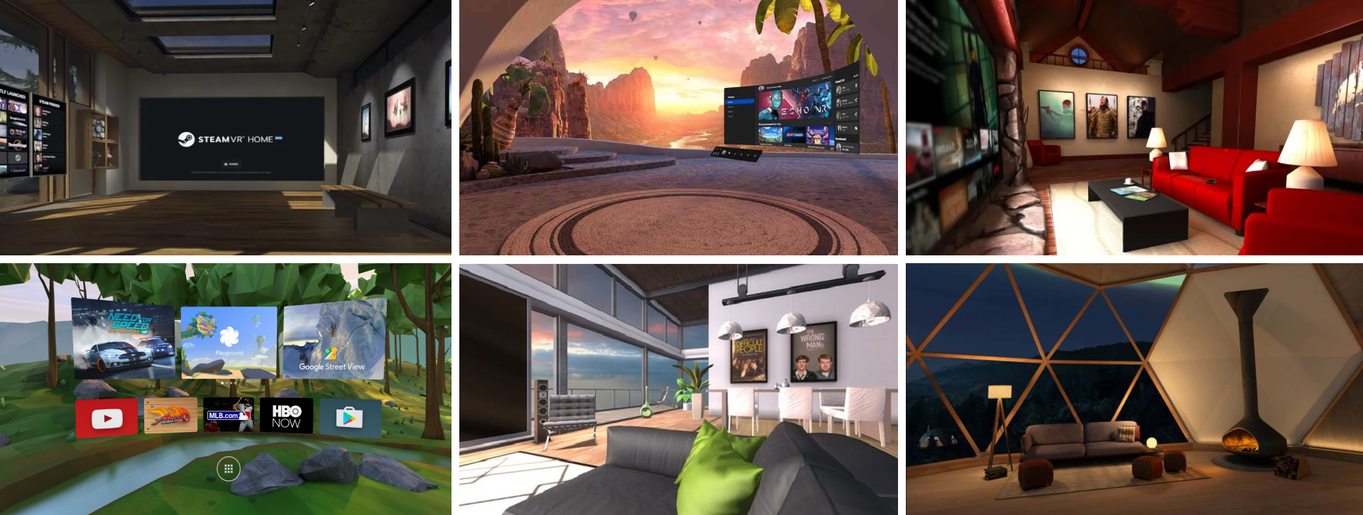
On the surface, this felt intuitive. In practice, it created confusion. Users would enter these spaces and immediately begin asking: Where am I? Whose space is this? Why does this exist?
Rather than creating comfort, these environments often introduced a subtle sense of disconnection. They looked like places users should understand, but didn’t behave like anything they had experienced before. I began referring to this pattern as the “human zoo”—a space designed to feel human-centered, but ultimately placing people inside a shallow metaphor of their own world.
The problem ran deeper. In XR, “home” could mean multiple things at once: a system shell, an application, or the user’s physical environment. Collapsing these into a single concept created ambiguity and cognitive friction.
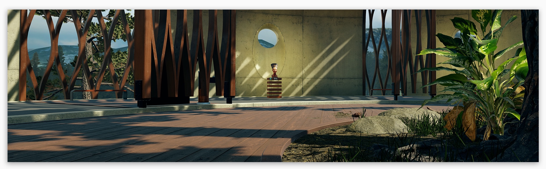
Instead of designing a home, we designed an origin.
Origin was conceived as a starting point for a user’s journey, a place of orientation, discovery, and possibility. It was not meant to be owned, returned to, or lived in. It was a threshold, not a destination.
From here, users could move fluidly into other experiences, without the expectation that they needed to “come back” to reset or reorient. This shift reframed the system.
Rather than anchoring users in a static environment, the experience began to move with them. Wherever they were became the beginning of what came next.
Origin also became an opportunity to introduce a different kind of engagement.
Instead of filling the space with explicit features, we embedded moments of discovery. In addition to various rotating installations and experiences, Origin also contained hidden puzzles that weren't obvious on first look: including a collection of vintage records scattered throughout a lounge-like environment. Each record contained a hidden symbol. When brought to specific locations, they revealed secret panels, unlocking collectibles, keys, and rewards.
These moments weren’t required. They weren’t explained. But they created a sense of curiosity and depth, encouraging users to explore, experiment, and linger.
It became a space people chose to spend time in, not because they had to, but because it offered something unexpected.
IMPACT
“Vive laid out a path that started to sync VR into our lives… it’s the vision Vive finally wove that we like, and we think consumers will see too.”
—Gearbrain, CES 2019
The Vive Reality System shipped as part of the Vive Cosmos platform and became the foundation for HTC’s consumer and enterprise ecosystem.
It defined a new design system for spatial computing, influencing not only VR experiences but also extending into mobile and cross-device interactions.
The system has reached millions of users globally and established a baseline for how spatial interfaces can balance familiarity with entirely new forms of interaction.
More importantly, it demonstrated that designing for emerging mediums requires more than adapting existing paradigms. It requires rethinking the relationship between user, system, and environment from the ground up.
REFLECTION
VRS reinforced the importance of designing for possibility without losing sight of usability.
In a new medium, it is easy to chase novelty or retreat to familiarity. The challenge is finding the balance between the two, creating something that feels both intuitive and transformative.
The HERO framework emerged from that tension and continues to inform how I approach the design of complex systems today.
Selected Works
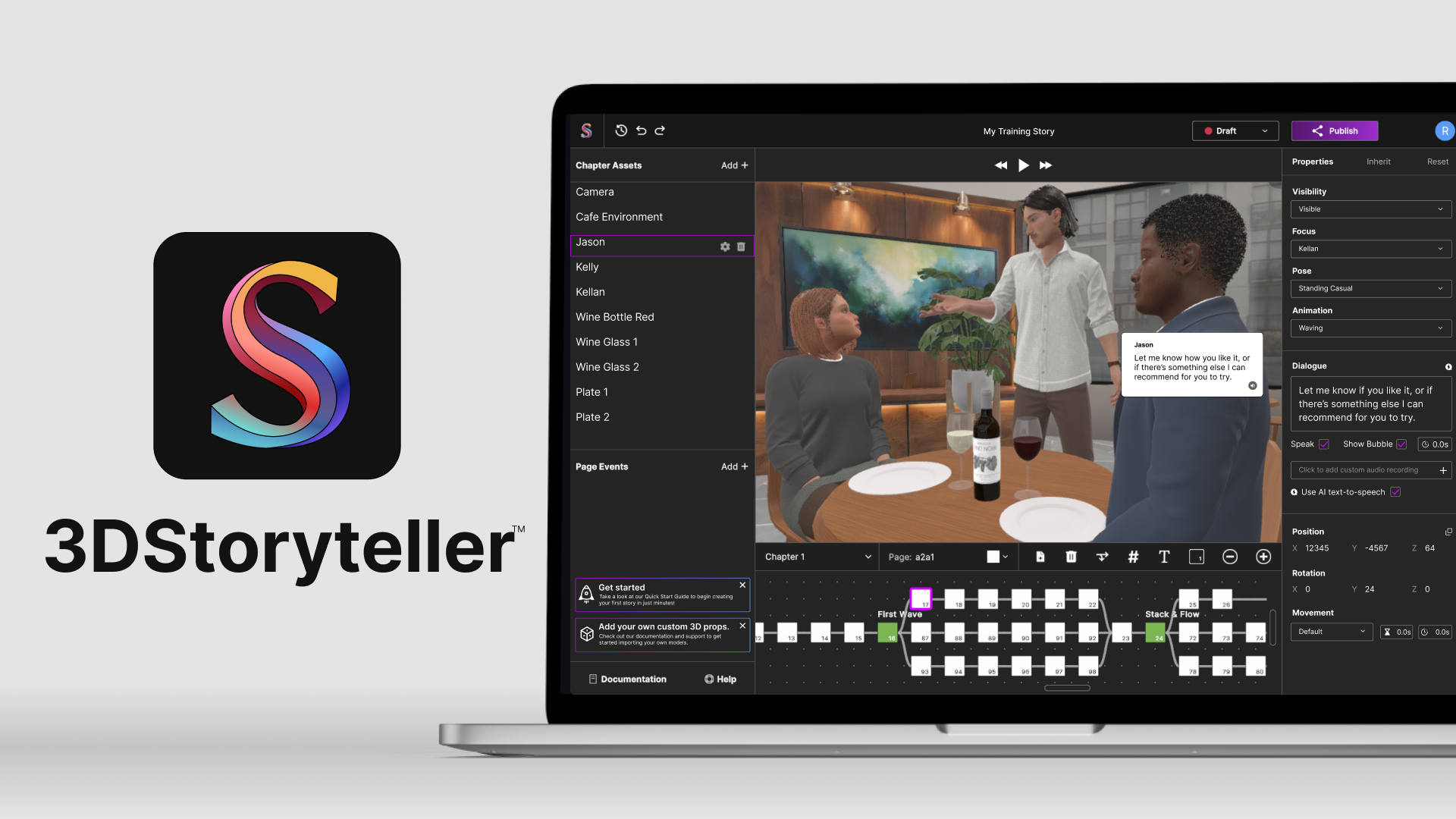
3DStorytellerExperiential Storytelling Platform
Vive Reality System (HTC Vive)Spatial Interaction System
Vive Video (HTC Vive)Immersive Media Player
PLAYON.tvStreaming Media Aggregator
SkryMinimal Wayfinding for Riders