SKRY
Reimagining rider safety through minimal, multi-sensory interaction
OVERVIEW
Motorcycling is defined by freedom, focus, and risk.
Unlike driving a car, riders operate in a constant state of heightened awareness. Every obstacle carries consequence. And yet, the technologies designed to support riders often do the opposite, introducing distraction and cognitive overload at the exact moments when clarity matters most.
SKRY was created as a response to this tension.
As part of my capstone at the University of Washington’s MHCI+D program, we set out to design a system that could enhance rider awareness without interrupting the experience of riding itself. The goal was not to add more information, but to deliver the right information, at the right moment, in the least intrusive way possible.
Team: Bonny Christopher, Christopher Chung, Ryan Gerber, Ricki Si Xie
Advisors: Garmin, UsTwo, Tactile
MY ROLE
I led the UX and visual design of the system, shaping interaction models, interface behavior, and overall experience. I worked closely with a multidisciplinary team across research, usability testing, and prototyping to translate insights into a cohesive product vision.
CONTEXT
At the time, emerging “smart helmet” and HUD systems were beginning to explore how digital interfaces could support riders. Most of these systems leaned heavily into feature density—navigation, messaging, alerts—often borrowing patterns from automotive or mobile interfaces.
But through early research and rider interviews, a different reality emerged; riders didn’t want more features. They wanted fewer distractions. They needed systems that respected the intensity of the riding experience—tools that could support awareness without competing for attention.
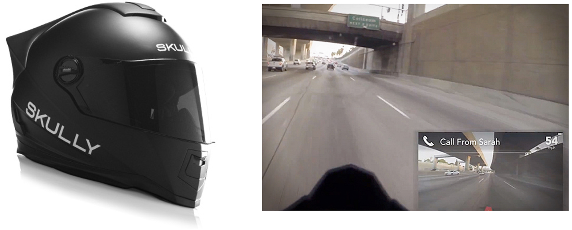
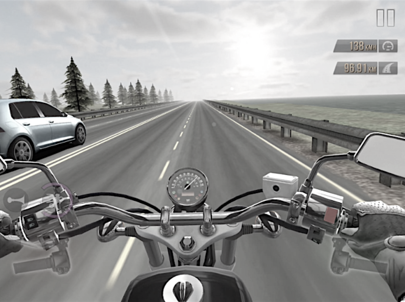
Image: A competitive analysis found that many rider awareness and 'safety' solutions in fact introduced distractions, like the "Skully" smart helmet, featuring dense information and even a rear-facing camera.
PROBLEM
How might we design a system that increases rider awareness and safety without introducing new distractions or cognitive load?
- Deliver critical information without pulling attention from the road
- Enable contribution without requiring manual interaction
- Design for moments of high cognitive demand, not ideal conditions
APPROACH
From the outset, we treated this as a research-driven design problem.
We conducted rider interviews, competitive analysis across automotive and aviation HUD systems, and iterative prototyping cycles to explore both interaction and perception under load. Rather than jumping to solutions, we focused on understanding the constraints of the riding experience itself.
One of the most important shifts came early. Instead of designing a feature set, we began designing around a principle:
The interface should disappear unless it is needed.
This became the foundation for every decision that followed.
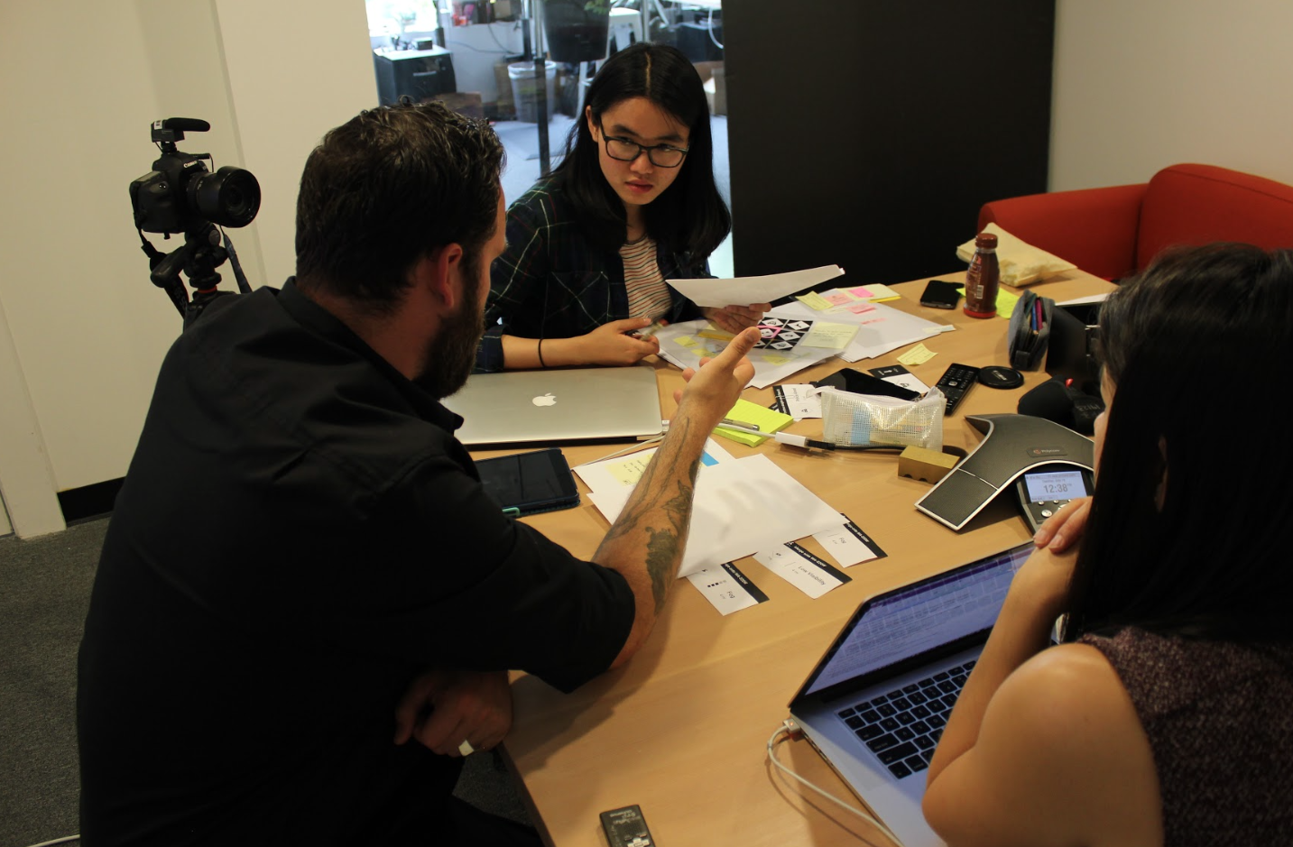
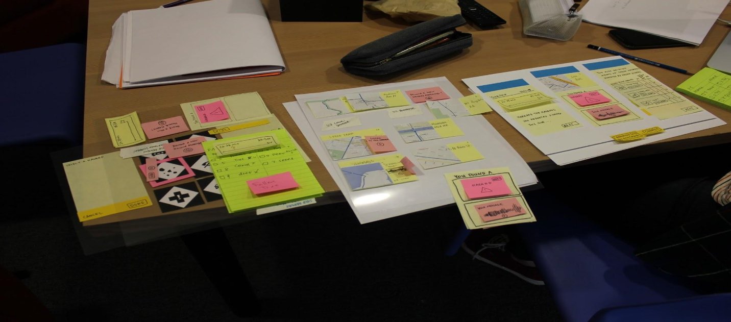
PROTOTYPING & EVALUATION
Our process relied heavily on iterative prototyping and real-time evaluation.
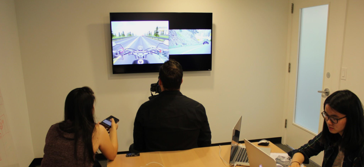
We developed a series of progressively refined prototypes, including a “Wizard of Oz” simulation that allowed us to test system behavior before building full functionality. In this setup, riders interacted with a simulated environment while we controlled system responses in real time, enabling us to observe behavior under realistic conditions.
To replicate the cognitive demands of riding, we paired a motorcycle simulation with HUD overlays and audio cues. This allowed us to study how users balanced attention between the road and the system.
We measured for:
- attention and gaze behavior
- recall and comprehension
- interaction timing and friction
- overall cognitive load
One key observation stood out immediately.
Users were glancing at the interface longer than expected.
This wasn’t a success signal. It was a failure. It meant the system was asking for too much attention.
KEY INSIGHT: AWARENESS REQUIRES RESTRAINT
Early prototypes leaned too heavily on visual feedback and tone-based systems.
We initially experimented with multiple audio cues to signal different states, but users struggled to differentiate between them. Even simple distinctions became confusing under cognitive load.
We also found that riders didn’t want to spend time interpreting information or managing interactions. Even small moments of friction—like remembering how to end a voice recording—became barriers.
The takeaway was clear:
In high-focus environments, simplicity isn’t a preference. It’s a requirement.
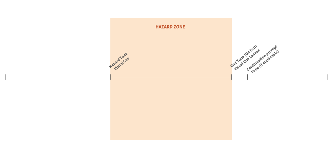
DESIGNING A MINIMAL, MULTI-SENSORY SYSTEM
The final system combined three key elements:
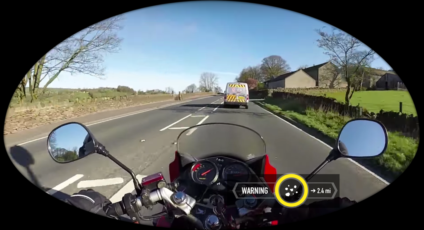
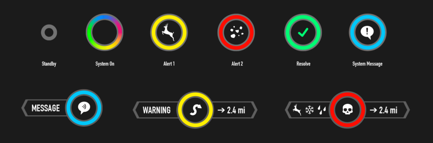
1. A Minimal HUD Interface
We designed a visual system that could communicate multiple layers of meaning at a glance.
- A simple circular indicator conveyed system state
- Color signaled urgency and type of alert
- Icons provided immediate context
- Secondary “wings” revealed additional detail only when needed
When inactive, the interface collapsed into a small, unobtrusive element in the rider’s peripheral vision, effectively disappearing until required.
This allowed riders to stay focused on the road while still maintaining awareness.
2. Voice-First Interaction
Manual interaction was not viable in a riding context.
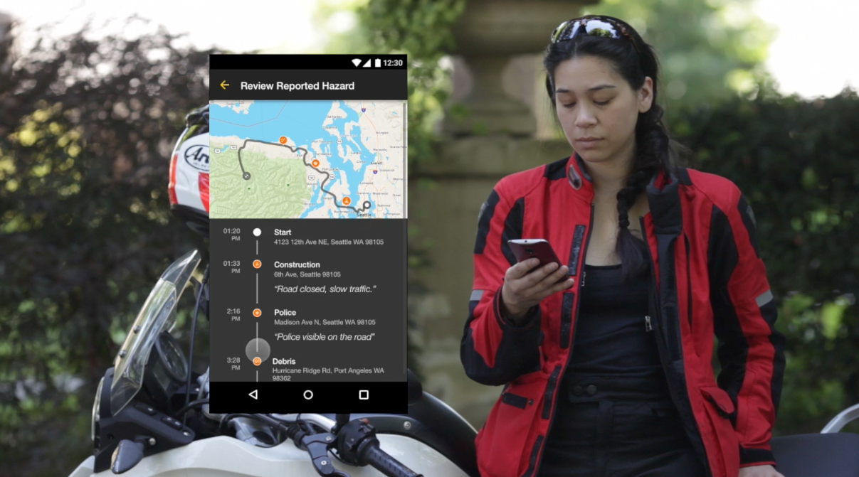
We designed a voice-driven system that allowed riders to both receive and report information without taking their hands off the bike. Riders could initiate reporting with a simple phrase and describe hazards in natural language.
We also explored how the system could guide interaction through voice prompts, reducing ambiguity and helping users understand what to do in the moment.
3. Crowd-Sourced Awareness
SKRY introduced a shared layer of awareness across riders.
Hazards were reported, confirmed, and relayed in real time, allowing riders to benefit from the experiences of others on the road. We tested how users responded to crowd-sourced information and found that while they valued it, they also questioned its reliability.
This led us to explore ways of structuring and validating input, including parsing and standardizing reported data to improve clarity and trust.
KEY LEARNING: REPORTING IS FRICTION
One of the more surprising findings was how difficult it was for riders to report hazards in the moment.
Even when motivated, users struggled to:
- decide what to report
- recall details after the fact
- invest time in reviewing or confirming hazards
This revealed an important tension. The system depended on participation, but participation introduced friction.
Our response was to:
- simplify reporting flows
- reduce required inputs
- introduce guided prompts
- minimize post-ride effort
The goal became not just enabling contribution, but making it feel effortless.
OUTCOME
SKRY demonstrated that it is possible to design systems that enhance awareness without disrupting experience.
Through iterative testing and refinement, we arrived at a solution that:
- reduced cognitive load through minimal interface design
- leveraged multiple senses to distribute attention
- enabled hands-free interaction through voice
- introduced a shared awareness model across users
The project was well received by both peers and instructors, and laid the groundwork for many of the principles I continue to apply today.
REFLECTION
SKRY fundamentally reshaped how I think about interaction design. It reinforced that the most important design decisions are often about what to remove, not what to add.
It also introduced a pattern that has stayed with me across my work: designing for real-world conditions means designing for constraint, not control.
You don’t get ideal users in ideal environments.
You get humans, under pressure, trying to make sense of the moment in front of them.
The role of design is not to impress them.
It’s to support them. Quietly, effectively, and in the ways that matter most.
Selected Works
3DStorytellerExperiential Storytelling Platform
Vive Reality System (HTC Vive)Spatial Interaction System
Vive Video (HTC Vive)Immersive Media Player

PLAYON.tvStreaming Media Aggregator

SkryMinimal Wayfinding for Riders